Unexpected Experience
Fendi approaches the product detail page with the same confidence and precision that defines its runway and atelier work. Rather than relying on excess or spectacle, the PDP balances refinement and intelligence, using motion, structure, and context to elevate the product while maintaining a clear path to purchase. The result feels aspirational, but never distant; expressive, yet highly controlled.
What stands out:
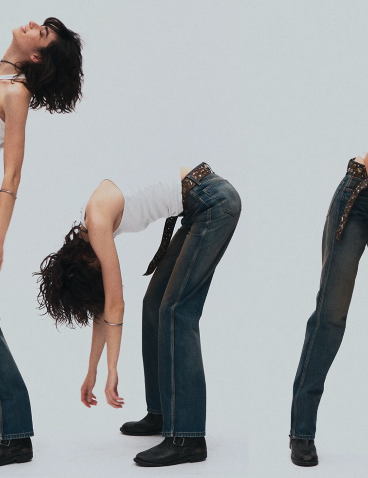
A PDP that feels composed rather than busy. Subtle animation, cinematic pacing, and carefully sequenced content guide attention without demanding it. The experience unfolds gradually, positioning the product within a broader world of craftsmanship, proportion, and use - signalling a brand-led encounter first, and a commercial one second.
Why it works:
Movement is used sparingly and with intent, bringing materials and form to life without overwhelming the page. Imagery invites close inspection of silhouette, texture, and construction, while practical decision-making tools - such as size and scale references - are integrated seamlessly into the flow. A short film highlighting Fendi’s personalised packaging adds a moment of theatre, reinforcing exclusivity and ownership rather than urgency. Supporting products are introduced with restraint, reinforcing the idea of curation rather than upsell.
Notable details:
- Controlled animation that enhances materiality and form
- Integrated scale and size references that aid decision-making without breaking immersion
- Video content that frames packaging as part of the luxury experience
- Complementary product suggestions presented with clarity and restraint
Overall impression:
A PDP that demonstrates how luxury commerce can be expressive without being excessive. Fendi’s approach shows that when motion, information, and storytelling are carefully orchestrated, the product page becomes an extension of brand authority - reinforcing desire, confidence, and long-term value, rather than chasing short-term conversion tactics.